Creating Art from Failure: The ‘Houses of the Holy’ Album Cover
Great artists turn limitations into strengths. Case in point: the cover art for Led Zeppelin’s Houses of the Holy, released 44 years ago.
The story of this astonishing design begins in 1972, when Led Zeppelin, at the height of its creative powers, commissioned the Hipgnosis team, led by Storm Thorgerson and Aubrey Powell, to design the cover for the band’s new album. Led Zeppelin had already recorded a diverse body of songs for the new LP, ranging from the soaring “Song Remains the Same” to the quiet, romantic “Rain Song.”
But Thorgerson and Powell were given access to none of the songs on the album. The only creative direction the band gave Hipgnosis was that the title of the forthcoming album was Houses of the Holy.
This was no small assignment. Led Zeppelin was one of the world’s most popular and powerful bands, with an image steeped in dark mysticism. As Thorgerson would remember in For the Love of Vinyl: The Album Art of Hipgnosis, “Something large, strong, powerful, awesome and mythic was clearly called for but what would that be?”
For source material, Thorgerson turned to Arthur C. Clarke’s 1953 science fiction novel Childhood’s End, an epic fantasy that culminates in a scene in which all the children in the world gather together, meld into a burning column, and depart the Earth.

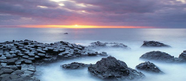
Thus inspired, Higpnosis sold Led Zeppelin on the idea of a naked family painted with silver and gold make-up, photographed at a remote, mystical, sun-kissed rock formation known as Giant’s Causeway in Northern Island. (A second, equally ambitious idea that was rejected, involved a photo shoot in Peru.) According to Thorgerson,
An image of the children clamoring towards some special spot from which they might depart en masse as spiritual or mental energy seemed eminently feasible and very evocative. It felt appropriate: civilisation climbing to a new dawn — a conception that was mythic like the band itself.
As author Mick Wall relates in his book When Giants Walked the Earth: A Biography of Led Zeppelin, Hipgnosis gave Led Zeppelin one caveat: the shoot would be expensive. Led Zeppelin Manager Peter Grant replied, “Money? We don’t fucking care about money. Just fucking do it!”
Little did anyone know how hard it would be to just do it.
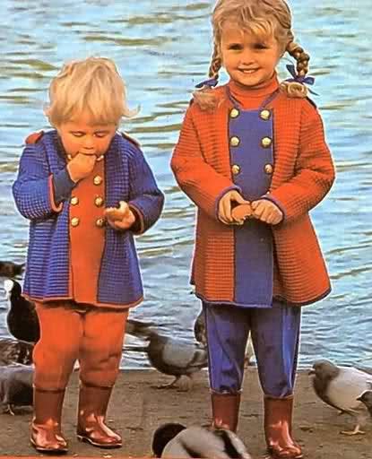
For an entire week, the design team covered three adults and two children with silver and gold make-up and dutifully drove to Giant’s Causeway at 4:00 a.m. in search of a blazing sunrise. Instead, the bleary-eyed team encountered gloomy, foul weather. As Powell would remember the shoot:
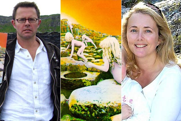
It proved to be an extremely difficult shoot. I had wanted a sunrise or sunset, but the weather was terrible. It was early November and rained every day. Then we ran out of make-up and had to resort to car spray paint. The two children, Samantha and Stefan Gates, and their stalwart mother braved freezing conditions and extreme boredom and became thoroughly fed up.
One of the adult models, Mark Sayer, would describe the shoot this way in 100 Best Album Covers: “A nightmare. Hot coffee, brandy, Mandrex, freezing rain, turpentine, tepid baths, bad food, boredom, damp beds, and misery.” Powell realized the original vision for the album cover was going to fail. There would be no glorious sunrise or sunsets on this photo shoot. So Powell improvised:
After five days I took a radical decision: it was not to be a family but children only. I realised that we could collage the cover together, due to the octaganal shaped rocks, if I photographed the children separately yet carefully composed, and in black and white.
Simplifying the design by using children and photographing the scene in black and white was a crucial decision. A black-and-white image essentially created a palette on which the team could create its own colors with hand tinting. After Powell created a black-and-white photo collage of the two children climbing the rocks of Giant’s Causeway, he re-photographed the image in a light sepia brown. Then artist Philip Crennel hand-tinted the photo, applying water-soluble colored dyes applied in layers with a brush and airbrush to create the explosion of color that makes the album so striking today. (“It took weeks to complete, but fortunately Led Zeppelin were very patient,” Powell remembered.)
Thanks to Crenel’s hand-tinting skills, the sky, rocks, and children on the resulting cover radiate a glow of orange, turquoise, and purple hues that inspire you to pause and explore the image like a museum painting. (“When I first saw it, I said, ‘Oh my God,’” Powell would remember. “Then we looked at it, and I said, ‘Hang on a minute — this has an otherworldly quality.’ So we left it as it was.”) The children, with their delicate bodies and ethereal white skin, look like they’ve crawled out of a Botticelli painting as they explore a field of pulsing rocks toward an unknown destination.
The naked children create a vibe of innocence and natural beauty. And yet the children evoke mystery, too. They are photographed from behind as they ascend the rocks. You cannot see their faces.
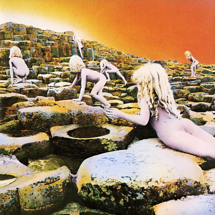
The arms of one of the children reach to the sky for reasons we do not know. (With their glowing locks, the children also suggest a younger, childlike vision of Led Zeppelin lead singer Robert Plant.)
The mystery deepens when you open the cover and the hand-painted inner sleeve presents itself. A naked adult holds a child in upraised hands in front of the ruins of a castle whose stones emit a faint glow beneath a blue-green sky.
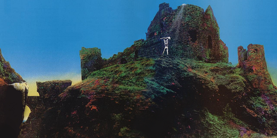
Again you cannot see their faces. You are left to wonder: what is going on? Are we seeing some sort of human offering? An exaltation? Do the castle ruins lie at the other side of the stones that the children climb on the cover? Like any good piece of art, the image raises questions without spelling out simple answers.
Powell would later recall Led Zeppelin “being over the moon” with the design of Houses of the Holy, but Hipgnosis would encounter further difficulties when the album was printed. In initial pressings, the rocks looked too orange and the children a ghastly purple. According to 100 Best Album Covers, Peter Grant “ordered Hipgnosis ‘to make sure that it’s printed perfectly.’ A dozen or more proofs were rejected until he demanded that Atlantic Records pay for the designers to stay in New York to see the project through.”
When the album finally appeared in March 1973, the cover was ringed with a white paper band known as an obi, which contained the name of the album written in Celtic style lettering. Record buyers had to break the obi to open the cover.
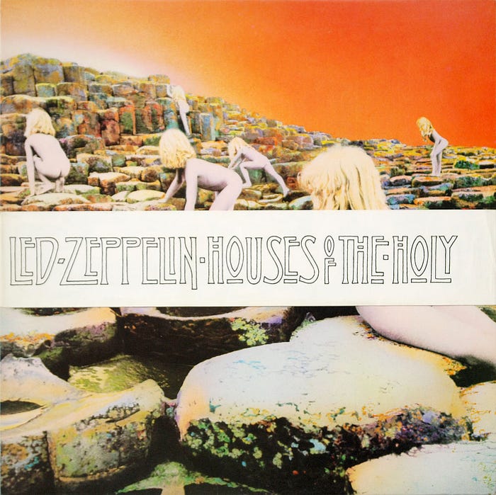
The obi band also partially obscured the children, whose nakedness offended some retailers. (As one of the children would remember 35 years later, “We were naked in a lot of the modeling shoots we did, nothing was thought of it back then. You probably couldn’t get away with that now.”)
Somehow Hipgnosis also reflected the art-rock sensibilities of the album itself even without hearing any of the songs. Many a Led Zeppelin fan will tell you the album sounds “bright,” as if the colors bled into the vinyl. (As a Guitar World interviewer once commented to Led Zeppelin guitarist Jimmy Page, “As absurd as this may sound, Houses of the Holy will always be an orange-sounding album in my mind,” to which Page replied, “Actually, I tend to agree with you.”)
For its sheer audacity and beauty, the cover of Houses of the Holy would be memorable no matter who recorded the album. But the cover also resonates, because it captures the evocative, powerful personality of Led Zeppelin.
Reflecting on the legacy of Houses of the Holy, Powell wrote, “The sleeve has received many accolades, but the one I liked the best is in the 1989 film Bill and Ted’s Excellent Adventure when, during the final scene, there is a description of ancient Greece: ‘In 470 B.C., a time when much of the world looked like the cover of the Led Zeppelin album Houses of the Holy…’ It was the start of many of our adventures with Robert and Jimmy, and long may they continue.”
Follow me on Twitter at davidjdeal.